
So. Y’all remember that “little” essay I was talking about a while ago?
Well, good news! It’s coming along nicely! I have a pretty solid first draft going at the moment. It’s still pretty messy, and there’s a lot more I want to add so it isn’t just me quoting people constantly. I meant to focus more on the content side of things today, but I got a bit… erm… distracted.
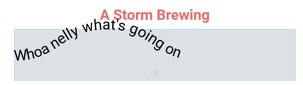
…yeah so the visual stuff caught my attention instead. But in my defense, I like making things look pretty!
…okay not a great defense- but as I’ve said many, many, many times already, I’m an artist. Visual presentation is just as important to me as the facts, and a whole lot more fun to mess with. So that’s what I decided to focus on instead! I found an interesting new WordPress theme that I think will work really well for what I want to do. Along with it came a recommended plugin- Elementor. And y’all, playing with that plugin was a lot of fun! It’s what made that wavy text above possible, so they already own my entire heart.
But still, everything feels pretty… simple right now. All I have at the moment is just a long, vertical string of text- and that’s no fun! I want something a little more flashy, something unique, something that’ll actually be fun to read. And to steal ideas- I mean- get inspired- I decided to check out some of the model texts our instructor set us up with.
And I think this is the one that resonates with me the most.
Snow Fall: The Avalanche at Tunnel Creek is very similar to how I imagined my final essay to look. There are pictures and video clips embedded into the essay, with the text seamlessly moving alongside it. At certain points, there are slideshows where you can click through and see more pictures and gather more information. And unlike other essays, it isn’t all just one downward scroll. Each section is broken up into different pages, so when you finish with one, you click a button to move to the next page. Not only is that a good way to help make information a bit more digestible, having everything on different pages lets you more easily save your spot so you can come back later- something that I want to be possible with my essay.
All that already covers quite a few of the 5 dimensions of interaction design. Words (1D) is pretty straightforward- the buttons to change between pages are clearly marked and each section has a giant header so there’s never any confusion as to where you are. I also already mentioned the visual representations (2D) in the slideshows and videos that encourage users to click through and see more. And for physical objects/space (3D), I only ever looked at this essay with my laptop and a mouse, and with how everything’s formatted, it works well with how I went through it. I could easily scroll down and see everything the essay has to offer, and not a single inch of my screen was wasted- sometimes, animations/videos take up the entire screen.
As for physical objects/space (4D), that’s something I didn’t actually mention: those visual elements are often hidden until you scroll down. Then, they’ll appear, ready for you to click on them. The sudden appearance of new videos is enough to catch your eye, only driving your curiosity even more. And all of that combined influences behavior (5D)- they all help keep users engaged and constantly interacting with elements on the page so they aren’t mindlessly scrolling through without really absorbing what they’re reading.
And how everything is laid out on the page aligns with the zigzag pattern illustrated here.
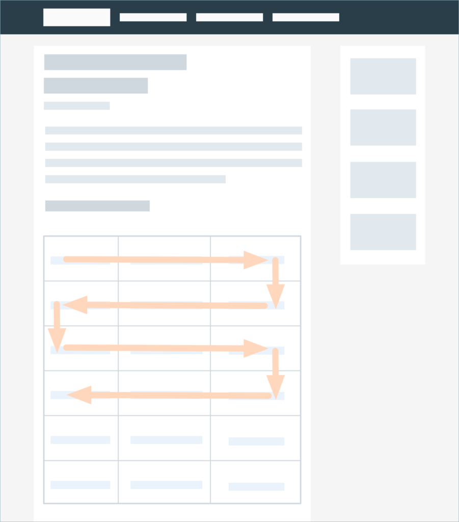
Both halves of the screen are utilized in that essay- some elements would appear on the right, others on the left. This helps guide your eyes through the page and aligns with how many folks skim pages.
So why bother with those kinds of layouts? The truth is that we as humans have a short attention span. And I’m not immune from that either. Giants walls of text are… hard for me to sit through, and that’s putting it very lightly. I’d often find myself checking my phone or bouncing between tabs whenever I couldn’t get my brain to focus. But with more visual elements, with interactivity, with layout that aligns with where my eyes naturally want to go, it’s a lot easier for me to read those long-winded texts without feeling like I had just ran a marathon.
I want to have similar means of interactivity. I want there to be lots of pictures that will give you more information when you hover or click over them. I want there to be animations and videos appearing throughout. And though it isn’t something I really thought about before, I might consider breaking up each of the sections of my essay into separate pages. I imagined it as just being on one, long page, but I didn’t realize the value of being able to stop and save your spot until now.
But we’re only at the beginning stages now. Knowing me and my habit of ditching outlines at the eleventh hour, I can only take a guess as to what my essay will look like when it finally goes live. And when it does, I hope you’ll take the time to read it! (or scan, I won’t judge)
I’ll be back at ya with more updates soon!
–Eliza